Dashboard Guide
Once the monitor is connected to the receiver and sensor nodes are active, the dashboard populates automatically. This page walks through each section of the dashboard from top to bottom.
System Status Banner
Section titled “System Status Banner”The colored bar at the top of the dashboard summarizes the overall network health at a glance.
| Color | Meaning |
|---|---|
| Green | Everything is nominal. All nodes are online and readings are within normal ranges. |
| Amber | Something needs attention. A node may be stale (not heard recently) or signal quality is weak. |
| Red | A critical condition has been detected. A node is offline, a sensor is overheating, or another threshold has been exceeded. |
The banner text describes the specific condition that triggered the warning or error.
Information Pipeline
Section titled “Information Pipeline”A visual strip showing the five conceptual stages your data passes through:
- Capture — Sensor reads a physical measurement.
- Represent — The reading is encoded into a protobuf message.
- Transmit — The message is sent over LoRa radio.
- Transform — The monitor processes and analyzes the data.
- Present — Results are displayed on the dashboard.
Stages illuminate as data moves through the system, providing a real-time visual of the data pipeline. This maps directly to the Information Internetworks thread concepts.

Stats Cards
Section titled “Stats Cards”Four summary metrics are displayed in card format:
| Card | Description |
|---|---|
| Total Reports | The total number of sensor reports received since the app started (or since connecting). |
| Nodes Online | How many distinct sensor nodes have sent data recently. |
| Average RSSI | The average signal strength across all recent packets (in dBm). |
| Network Health | A composite health score computed from node connectivity, signal quality, and sensor readings. |
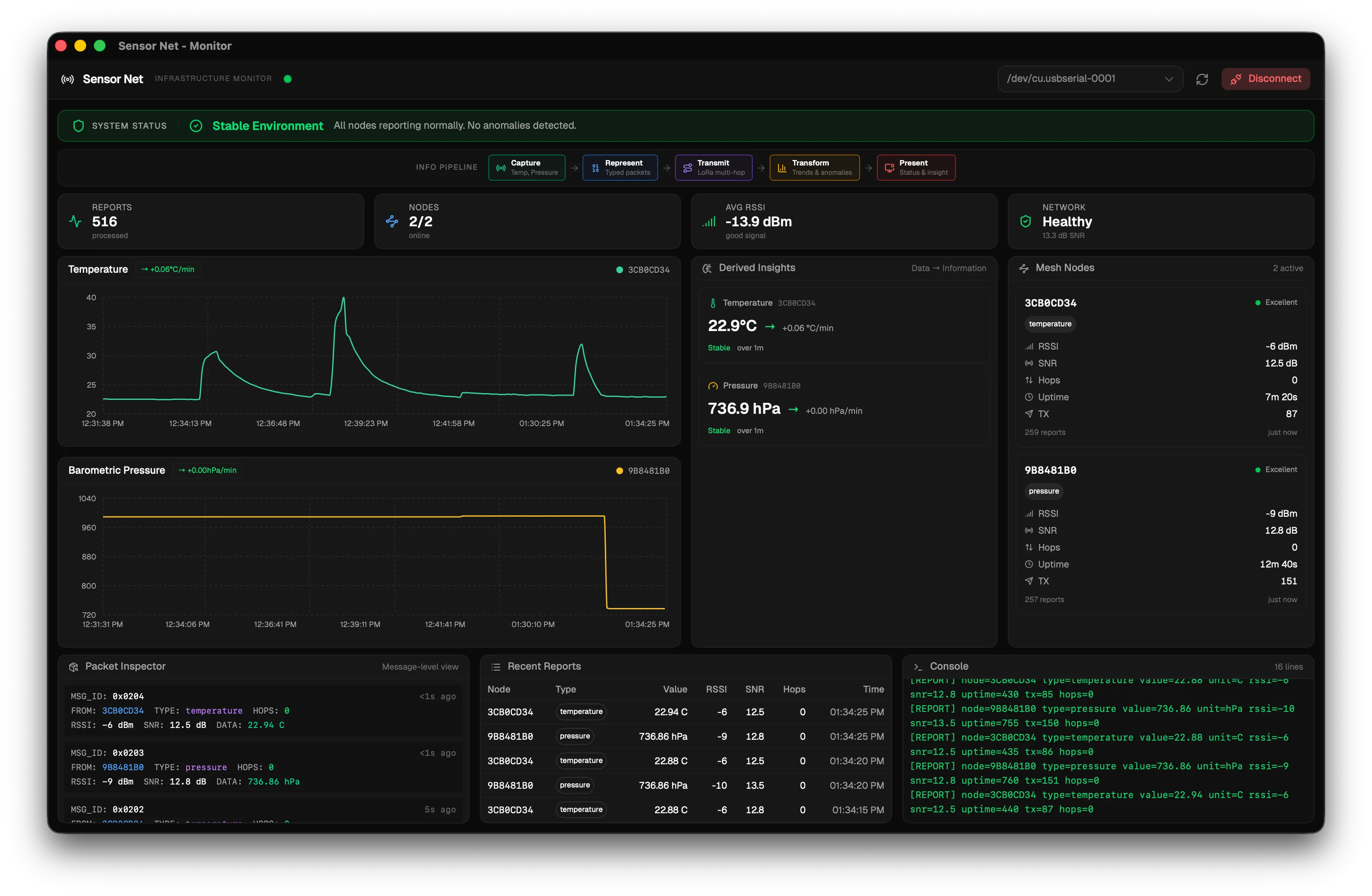
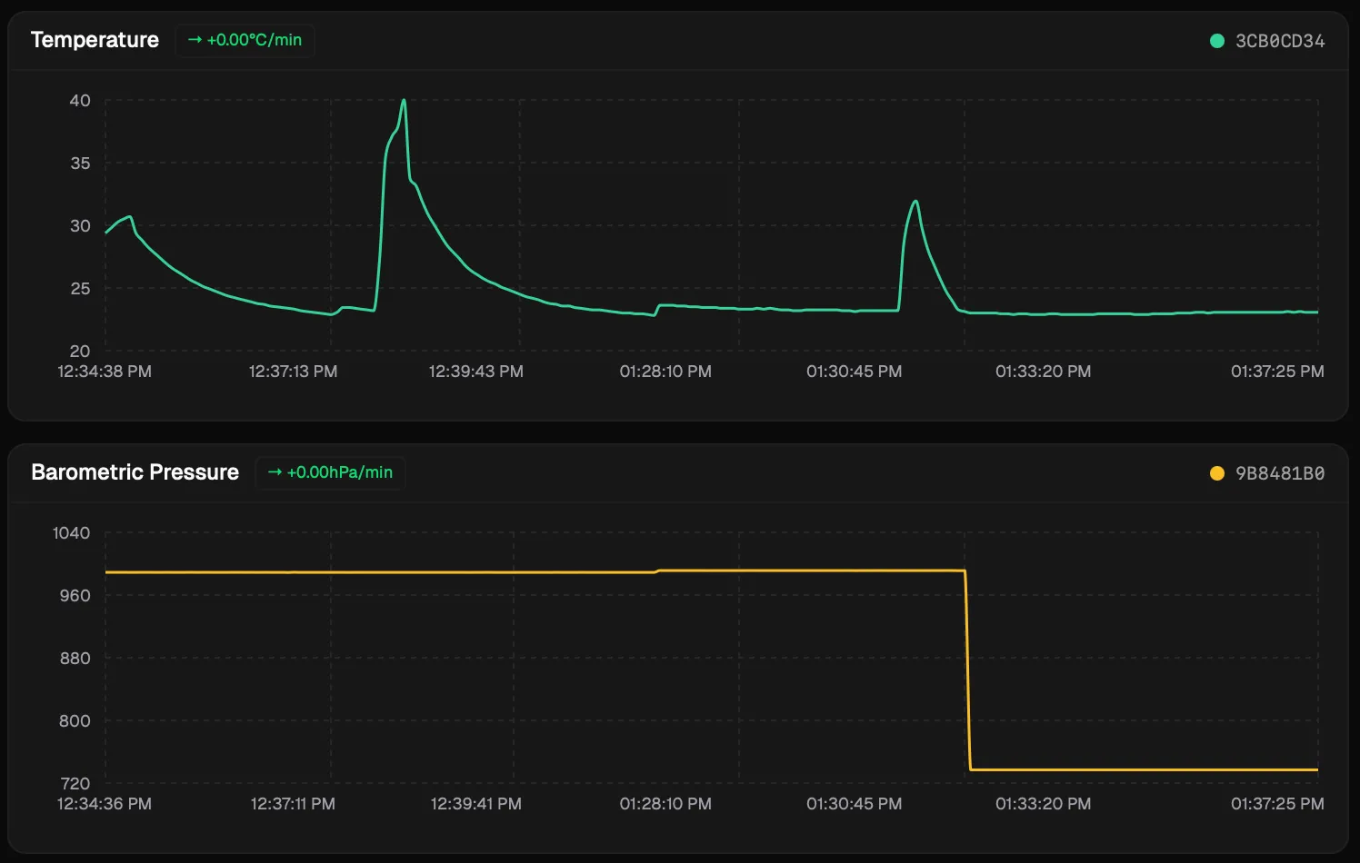
Sensor Charts
Section titled “Sensor Charts”Two line charts display sensor data over time:
- Temperature Chart — One colored line per temperature node, plotting readings over time.
- Pressure Chart — One colored line per pressure node, plotting readings over time.
Each node’s line is labeled with the node ID. If enough data points exist, a trend badge appears next to each node name indicating the current trend direction:
| Badge | Meaning |
|---|---|
| Up arrow | Rising trend |
| Down arrow | Falling trend |
| Right arrow | Stable (no significant change) |
Trend detection requires at least 3 data points before it activates (configurable via MIN_POINTS_FOR_TREND in the Analytics Thresholds).
Derived Insights
Section titled “Derived Insights”This section shows what the data means beyond raw numbers. For each node and sensor type, you can see:
- Current reading — The latest value from this sensor.
- Trend direction — Rising, falling, or stable.
- Rate of change — How fast the value is changing (e.g., +1.2 degrees C/min).
- Anomaly flags — Alerts for conditions like overheating (temperature above threshold) or rapid pressure drops.
Anomaly thresholds are configurable. See Analytics Thresholds for the full list.

Node Cards
Section titled “Node Cards”One card is displayed per active node, showing detailed connectivity information:
| Field | Description |
|---|---|
| Signal Quality | Descriptive label (Excellent, Good, Fair, Weak, Offline) |
| RSSI | Most recent signal strength in dBm |
| SNR | Most recent signal-to-noise ratio in dB |
| Hop Count | How many relay hops the last packet from this node took |
| Uptime | How long the node has been running since its last boot |
| Last Seen | How recently the last packet was received from this node |
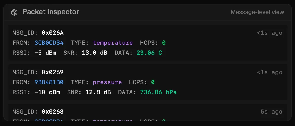
Packet Inspector
Section titled “Packet Inspector”A table showing the last 20 received packets in a format inspired by network protocol analyzers. Each row shows:
| Column | Description |
|---|---|
| Message ID | The unique packet identifier in hexadecimal |
| Source Node | The originating node’s ID |
| Sensor Type | Temperature or pressure |
| Hops | Number of mesh relay hops |
| RSSI | Signal strength of the received packet |
| SNR | Signal-to-noise ratio |
| Value | The sensor reading with its unit |
This view is useful for debugging mesh behavior — you can see which packets were relayed and how signal quality varies per packet.
Report Table
Section titled “Report Table”A scrollable table showing the last 30 raw reports stored in the database. Each row displays the unprocessed field values exactly as they were stored. This is useful for verifying that data is being parsed and stored correctly.
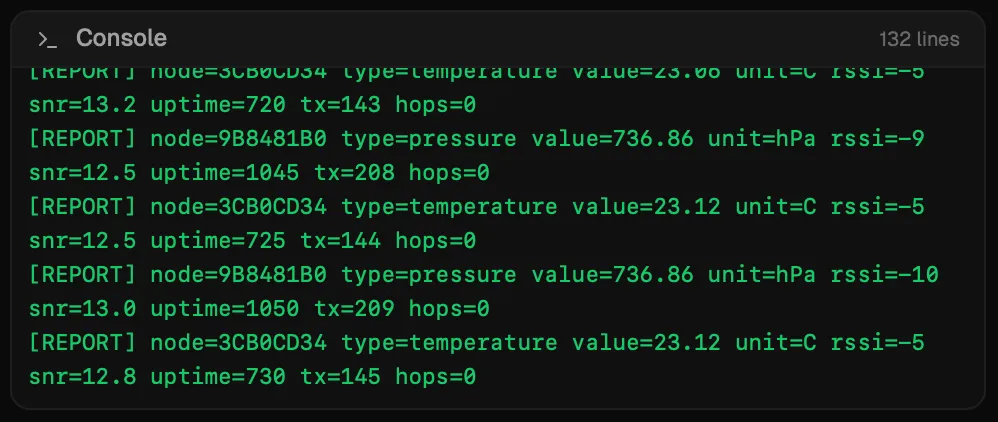
Log Console
Section titled “Log Console”The bottom of the dashboard shows the raw serial output from the receiver node, line by line. This is the unprocessed text received from the USB serial port.
Lines that contain valid [REPORT] data are highlighted in green. All other log lines (startup messages, radio status, etc.) are displayed in the default color.
The log console is useful for debugging — if the receiver is printing data but the dashboard is not updating, you can check here to see whether the lines are being parsed correctly.
Next Step
Section titled “Next Step”To learn how to modify the monitor application’s code, see Extending the App.